Recent events have put oil at the forefront of discussion. Much has been made of the impact of Libya and the putative claims from the Saudi's of being able keep the market well supplied. The purpose of this article is to put aside the day-to-day noise and to focus on two key trends. It should be abundantly clear that these trends combined with MAD policies of the Federal Reserve are at the root of the rise in oil. It will also be demonstrated that the games played by the BLS have company in the IEA reporting of oil supplies:
- Despite the small upticks in reported oil production since 2005, we are spinning our wheels
- Crude Oil: the black goo that we see in all those film archives of well blowouts
- Condensate: lighter hydrocarbons that condense out in crude production (remember that the oil originates below the ground, associated gases such as propane, ethane, condense out at the lower temperatures at the earths surface). Condensate is lumped in with Crude oil, hence the term C+C.
- Natural Gas Liquids: (NGL) Again lighter hydrocarbons that primarily originate in Natural Gas wells
- Other liquids such as ethanol and other bio-fuels
- Refinery gains: This is term that reflects the ability of some refiners to break down (hydro-crack) the crap left at the bottom of the column. Think of tar, now breakdown the tar by adding some energy and a hydrogen source to produce lighter weight hydrocarbons. These lighter hydrocarbons have a greater volume and voila, you have now increased the volume of "oil" you produced.
Relying on the tireless work of Rune Likvern over at the oildrum.com:
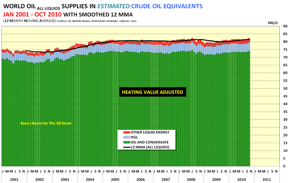
Fig 1: Total Liquids production EIA data: Jan 2001 - Oct 2010 showing the breakdown of C+C, NGL and Other Liquids. The price of Brent is also shown.
From this graph it appears that world oil supplies are crawling onward and upward. Closer examination shows that the green C+C component has hardly budged since 2005 and that the gains have been in the NGL and Other Liquids.
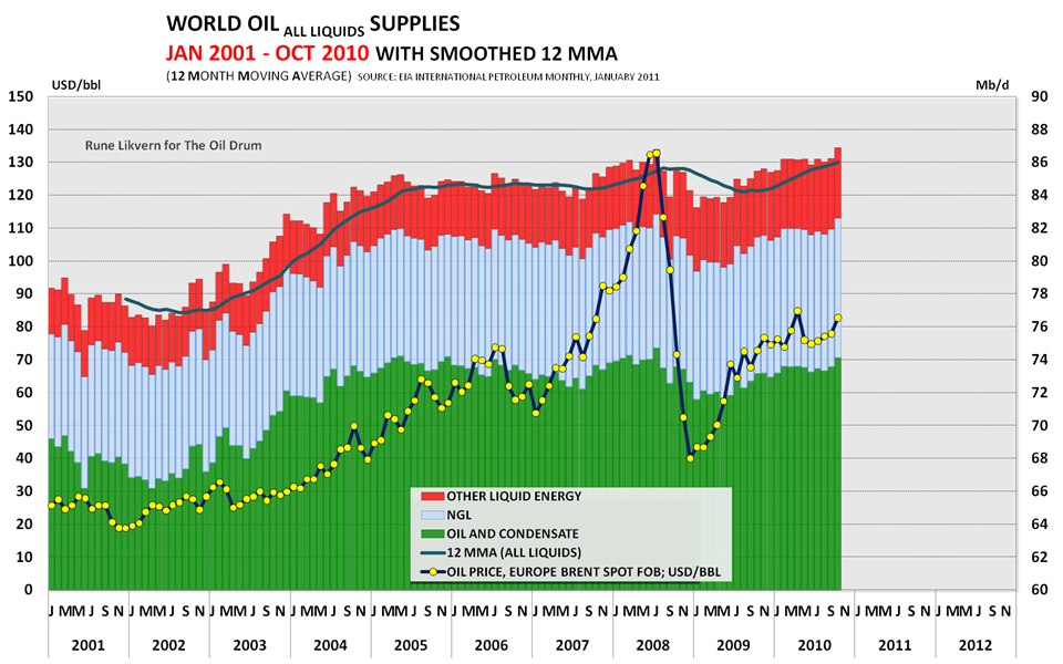
Now, lets do a little work, lets correct for the actual energy of the observed "oil" production. In essence, what is being done is well known to anyone who saw their gas mileage decrease with the advent of E10. You all agree that a tankful of ol'time E0 is going to take you further than a tank of E85. It is noteworthy to point out that the spot price of propane has converged to it's relative energy content to crude oil over the past 10 years.,
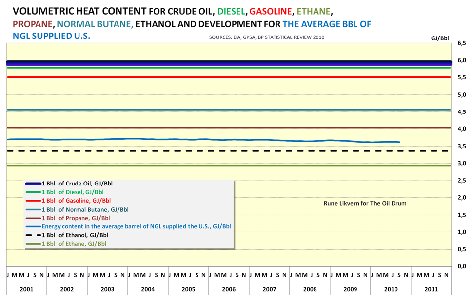
Fig 2: This graph shows the relative energy content of the components comprising the "All Liquids" graph. The width of the crude line reflects the variation between different types of crude oil.What happens when you apply these factors? Figure 3 shows world oil supplies normalized by the volumetric energy content. The relative contributions from the three sources is shown. It has flatlined for 5 years, the effect of the Great Recession is also visible. The economic activity directly tied to the use of liquid fuels is constrained by the energy of those liquids. Energy supply is flat, increased demand since 2005 is helping to drive the price of oil higher. This is ECON 101.
Fig 3: Volumetric Energy corrected to crude oil equivalent for All LiquidsRecently, an interesting new way of evaluating world oil supplies has been developed and explored, Jeffery Brown and Sam Foucher took the time to look at the net exports of oil producers. They christened their creation "Export Land Model" or ELM for short. The model is explained here,
- And now for the bad news...
Export Land Model:
and a recent update is found here that also discusses Egypt:
Net Exports and Egypt:
The gist of the model, is that as Oil Exporting nations grow economically, their internal oil usage increases
leading to fewer Net Exports. They also observe that once production in an Exporting country peaks, the time until they become a net importer is very quick. Two classic examples are Indonesia and the United Kingdom where the transistion took roughly 7 years. History buffs out there will recall that one of the reasons for Japan's venture into WWII was to secure the Dutch East Indies for its oil. Indonesia is now no longer even a member of OPEC. Here is a graph of the UK, those Thatcherites out there might just want to reevaluate the reign of the "Iron Lady" in the light of oil exports. I really do feel sorry for the Brits, not only did they dump their gold at the "Brown Bottom", they also pumped and sold their oil at the bottom. History will only wonder, what were they thinking?? The UK imports increased 5.4% in 2009 yoy.
Graph of UK Net Oil exports:
The following chart summarizes their findings: In 2005, these nations combined to export 46.0 mm bpd, in 2009, these same countries combined to export 42.6 mm bpd. This is a decrease of 7.4%. Also note that while demand in the OECD is lower, the increase in Chindian demand all but overwhelms the effect. The US is no longer the driving force on the world energy markets.
It is clear that the ELM has predictive power. Note the agreement between Net Exports and the Model
A final note on the ELM: Past studies have suggested that the price of oil has a demand inelasticity of -0.06 to -0.07, or 1% decrease in supply leads to roughly a 14-16% increase in price, In 2005, Brent was roughly $40 per barrel, just applying the inelasticity effect suggests a Brent price of roughly $83 and correcting for the DXY (~90/76) gives $98 a barrel. Remarkably consistent given the simplicity of the analysis and the fact that the analysis of the 2010 data is not yet complete.
Conclusion:
There are two underlying trends affecting the world oil markets, the flat net energy of the liquids supplied to the market based and the emergence of the Export Land Model. Both are bullish signals for oil, and short of a deflationary collapse, the trend towards higher liquid energy prices is clear. Short oil at your own peril
Addendum:
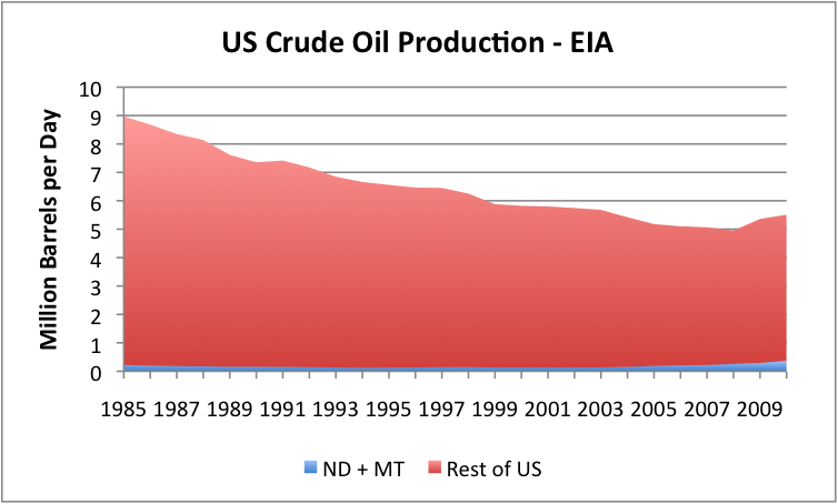
There has been much discussion of the significance the Bakken Oil field here at the Hedge. I include one figure, as it is worth a 1000 words: (Graph courtesy of Gail Tverberg of theoildrum.com)